01 — The story
The brief
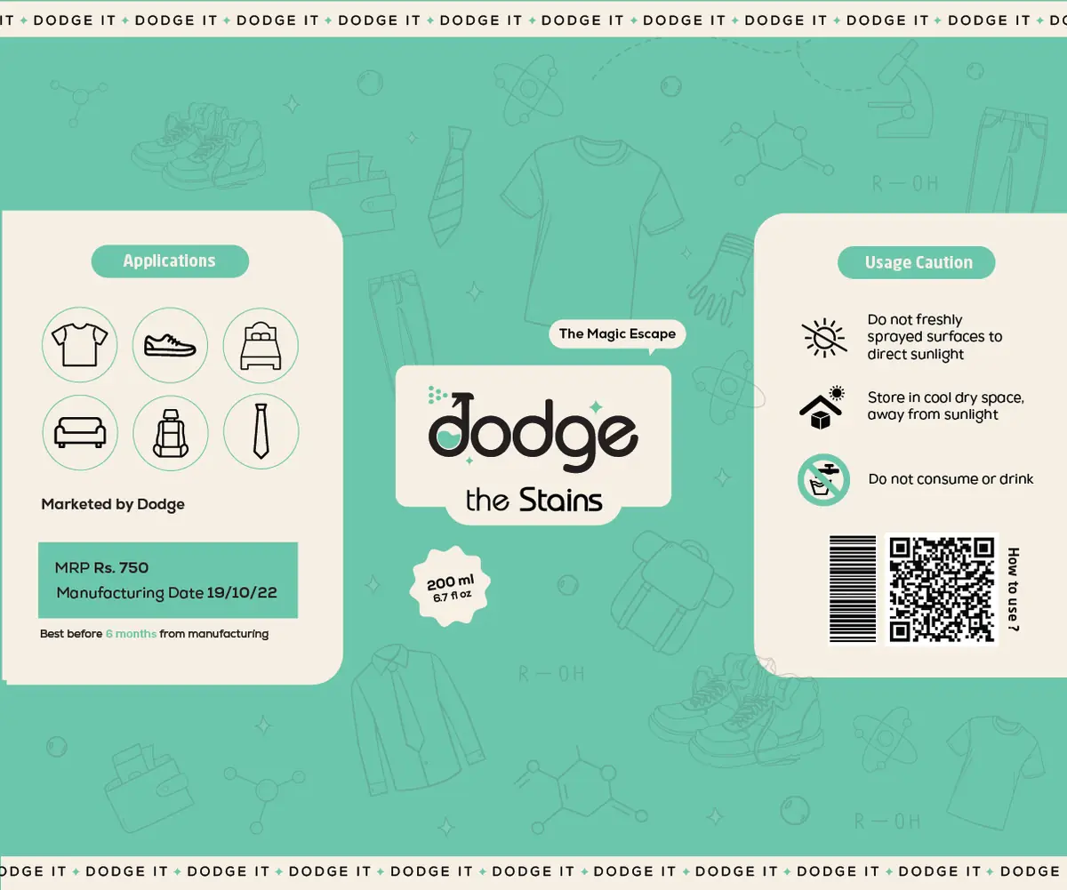
Bottle design is a shelf fight. The label has a second to be noticed, a second more to be understood, and it has to survive being wrapped around a curve.
What we built
A high-contrast label system built for impact at distance and legibility up close, with the brand marks positioned to stay readable on a rotating surface.
Why it works
It reads from three feet away and rewards a closer look. That’s the entire job of a bottle.