Identity systems, brand books and the rules that stop a brand drifting.

 Interior design13 spreads
Intscape
A studio doing millimetre-precise work looked improvised on paper. We built the system that fixed it — mark, palette, type, grid and the rules that hold under deadline.

 Ayurvedic skincare13 spreads
Arto of Vedas
Ayurveda sells on heritage and loses on shelf. A logomark built from the five elements, then the spacing maths, palette and pattern that let the range grow without drifting.
 Grooming24 pieces
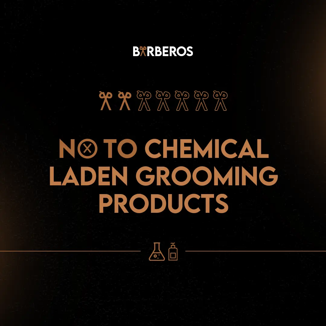
Barberos
Positioning written before a single graphic was drawn — then the kit, signage, campaigns and ad sets that all came out of it.
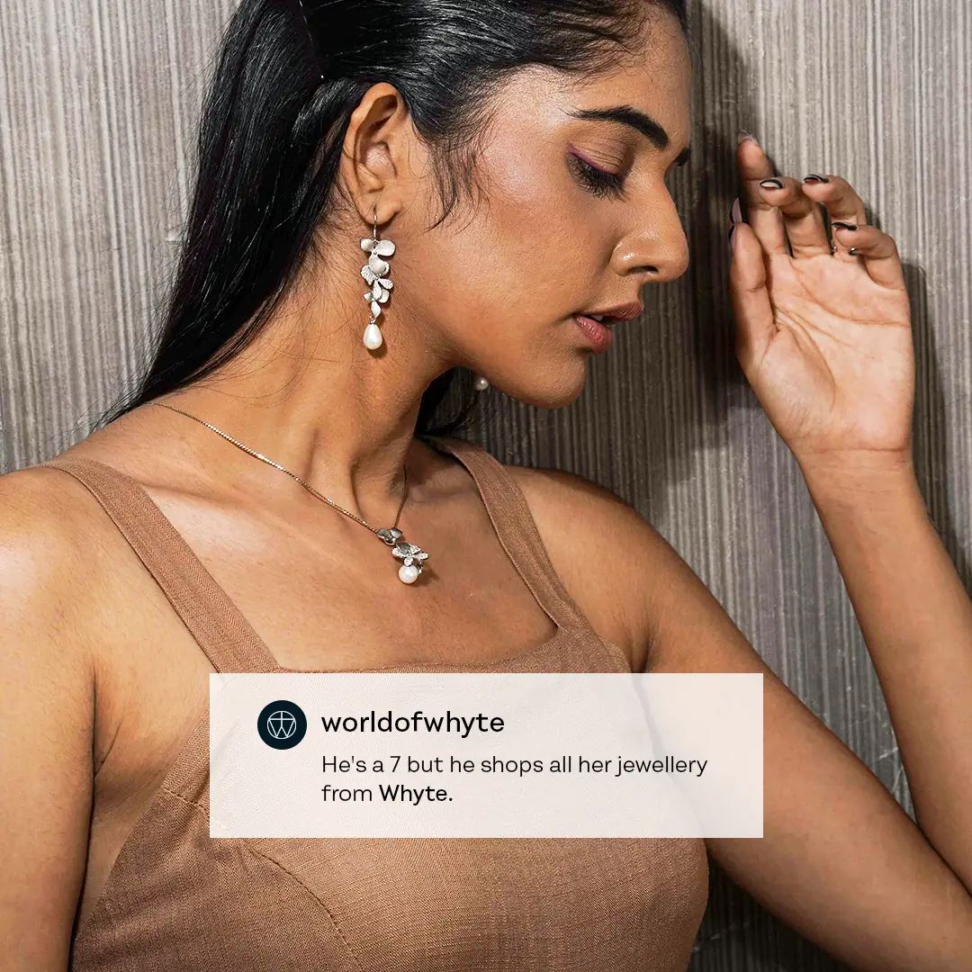
 Consumer brand5 pieces
Whyte
A young brand that needed to look grown-up on day one, without locking itself into an identity it would outgrow.
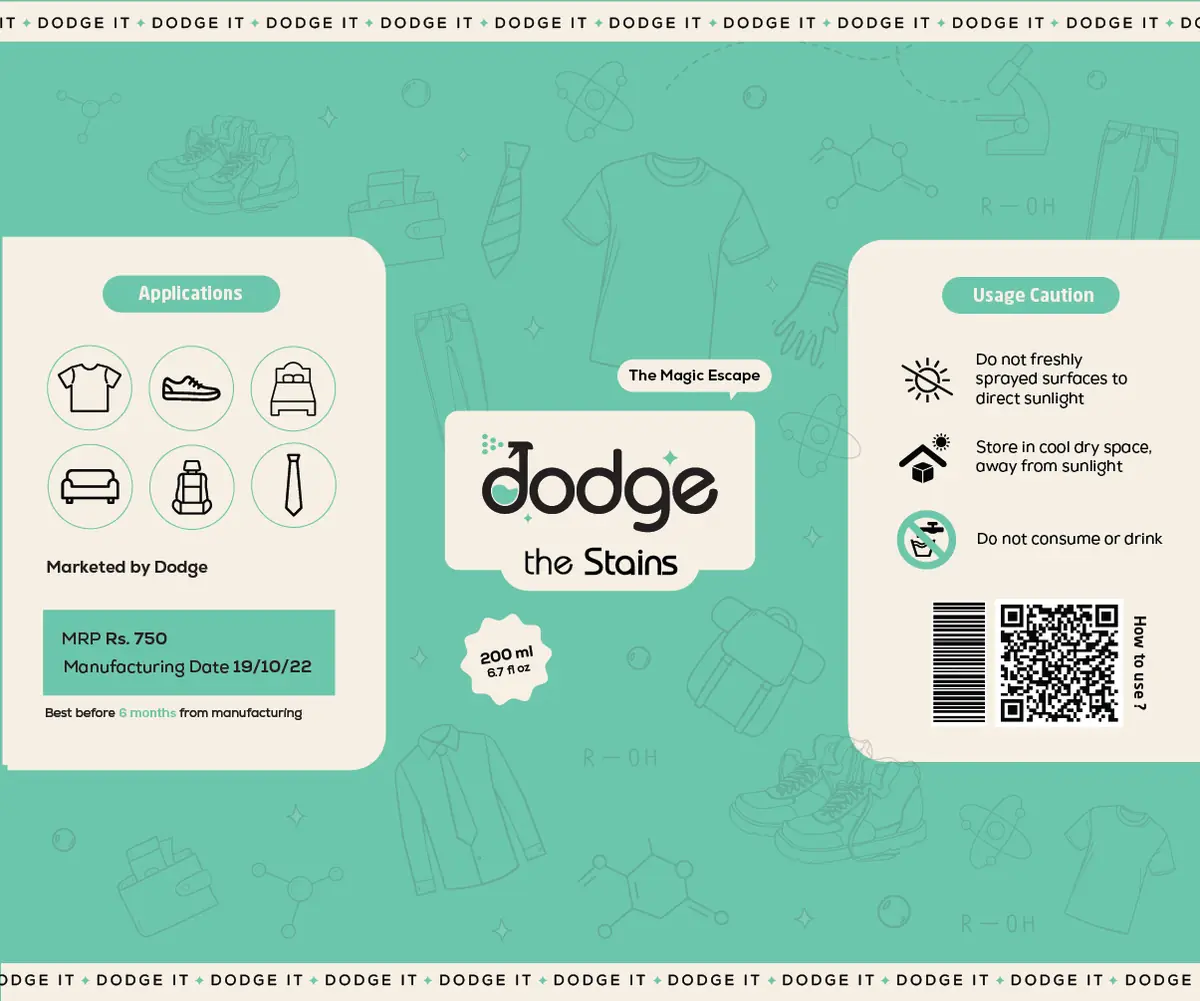 Beverage1 piece
Dodge
Bottle design is a shelf fight. High contrast for distance, detail for the hand, built to survive a curve.

 Wellness & skincare16 pieces
Reasthetics
In skincare the label does the selling. A packaging architecture with a hierarchy that survives every new SKU, matched by the web creative.

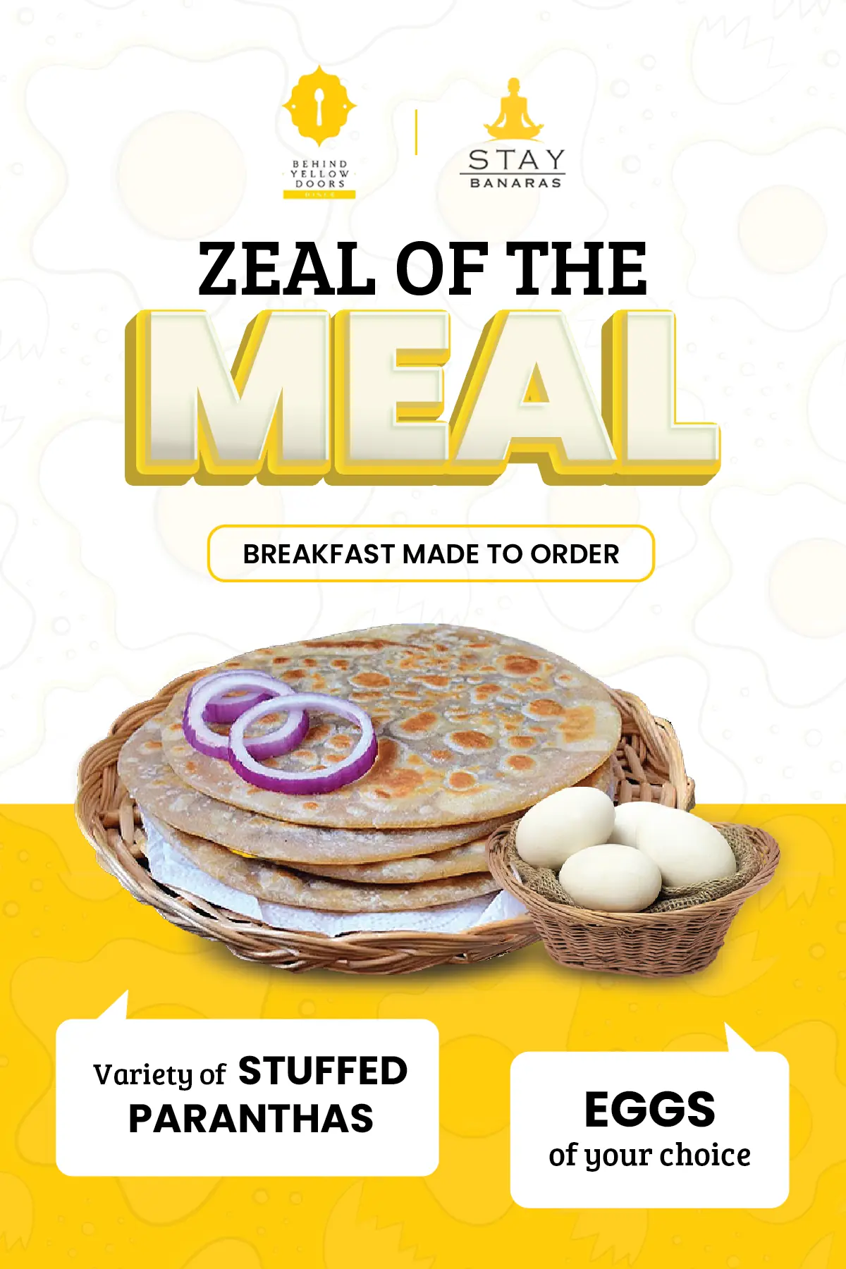 Print & collateral3 pieces
BYD Designs
Print is unforgiving. Production-safe colour, real-world type sizes, layouts that survive trimming.